From R to interactive charts and maps
Coding online graphics from scratch using JavaScript libraries such as D3 is a laborious process.
For standard, reproducible chart types, we will today explore another approach: Making JavaScript visualizations directly from R/RStudio. This is possible thanks to a group of packages collectively known as htmlwidgets.
These packages take instructions in R code, and write the JavaScript and HTML necessary to draw charts using JavaScript visualization libraries. They also allow you to easily export the charts you create in R as responsively designed web pages, which can be embedded in other projects through simple iframes.
This means you can work in a single environment to both process data and make online charts. Maintaining a simple, streamlined workflow makes it easier to produce graphics quickly on news deadlines.
The data we will use today
Download the data for this session from here, unzip the folder and place it on your desktop. It contains the following folders and files:
nations.csvData from the World Bank Indicators portal, as used in week 3 and subsequently.food_stamps.csvU.S. Department of Agriculture data on the number of participants, in millions, and costs, in $ billions, of the federal Supplemental Nutrition Assistance Program from 1969 to 2016, as used in week 8.seismic.zipZipped shapefile with data on the risk of a damaging earthquake in 2017 for the continental United States, from the U.S. Geological Survey.test.htmlWeb page to embed the interactive charts and maps we make today.
Setting up
Launch RStudio, create a new RScript, and set the working directory to the downloaded data folder. Save the script as week13.R.
First we will install the package htmlwidgets, which will make it possible to save the charts and maps we make as web pages:
# install and load htmlwidgets
install.packages("htmlwidgets")
library(htmlwidgets)
Make ggplot2 charts interactive with ggiraph
ggiraph is a package that adds some simple interactivity to charts made with ggplot2 code.
The following code loads and installs the package, then loads the food stamps data we used previously to make ggplot2 charts in week 8.
# install and load ggiraph
install.packages("ggiraph")
library(ggiraph)

# load readr, dplyr and ggplot2 packages
library(readr)
library(ggplot2)
library(dplyr)

# load data
food_stamps <- read_csv("food_stamps.csv")
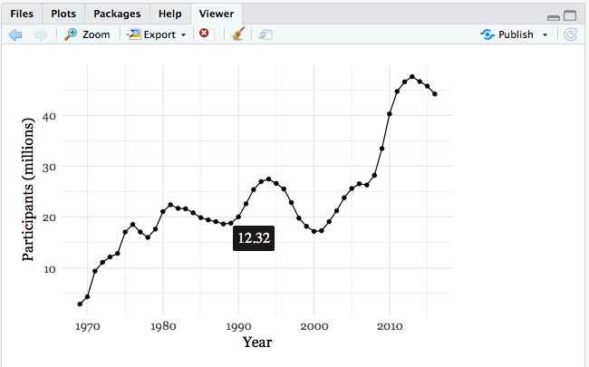
Now we will remake the dot-and-line chart from week 8, with some small differences to give hover tooltips showing the program’s cost.
# dot-and-line chart of
food_stamps_chart <- ggplot(food_stamps, aes(x = year, y = participants)) +
  xlab("Year") +
  ylab("Participants (millions)") +
  theme_minimal(base_size = 14, base_family = "Georgia") +
  geom_line() +
  geom_point_interactive(aes(tooltip = costs))

print(food_stamps_chart)
This code saves a ggplot2 chart in your environment, as we’ve seen before. But here we used geom_point_interactive, rather than geom_point to add the dots to the chart. Inside this function there is an aes mapping that assigns values from the costs variable to a tooltip. Simply plotting the saved chart gives a standard ggplot2 chart in the Plots panel at bottom right.
The following code uses the ggiraph function to turn the saved chart into a web page in which the chart is rendered using D3 as an SVG (scaleable vector graphic) with hover tooltips.
# make interactive version of the chart
food_stamps_interactive <- ggiraph(code = print(food_stamps_chart), height_svg=4)

print(food_stamps_interactive)
The code also sets the height of the resulting SVG object to 4 inches using height_svg=4.
The following chart, with a hover tooltip, should appear in the Viewer panel:
Now we can save the chart as a web page, using the following htmlwidgets code:
# save chart as a web page
saveWidget(food_stamps_interactive, "food_stamps.html", selfcontained = TRUE, libdir = NULL, background = "white")
Open the saved web page in your browser and notice that the chart is completely responsive: It will adjust its size to fit the space available.
Now we will add a hover effect to the points and customize the text and appearance of the tooltip using the following code:
# save plot
food_stamps_chart <- ggplot(food_stamps, aes(x = year, y = participants)) +
  xlab("Year") +
  ylab("Participants (millions)") +
  theme_minimal(base_size = 14, base_family = "Georgia") +
  geom_line() +
  geom_point_interactive(aes(tooltip=paste0("cost: $",costs," billion"),
                             data_id = year))

# make interactive version
food_stamps_interactive <- ggiraph(code = print(food_stamps_chart),
                                   height_svg = 4,
                                   hover_css = "cursor:pointer;fill-opacity:0.5;stroke:red;r:4px",
                                   tooltip_extra_css = "background-color:#f0f0f0;color:black;padding:5px")

print(food_stamps_interactive)

# save as web page
saveWidget(food_stamps_interactive, "food_stamps.html", selfcontained = TRUE, libdir = NULL, background = "white")
This code uses the R function paste0 to produce a more useful tooltip, spelling out the costs in billions of dollars. paste0 concatenates or pastes together strings of text, separated by commas.
The geom_point_interactive function now includes data_id = year. Assigning a variable in the data to data_id is necessary to apply hover styling; you should use a variable that uniquely identifies each graphic element to which the hover styling applies — here year works because there is only one point for each year.
The ggiraph function now includes hover_css, which uses CSS (Cascading Style Sheets) code to change the appearance of the points when they are hovered over: This example changes makes the points semitransparent, gives them a red outline, and increases their diameter to 4 pixels.
The ggiraph function also includes tooltip_extra_css, which here changes the background of the tooltips to a light gray, makes the text black, and adds a padding of 5 pixels around the text.
Embedding htmlwidgets in responsive iframes
In practice, you will want to embed your interactive charts in other web pages. This can be done using responsive iframes.
Open the test.html web page in a text editor. It contains the following CSS code in beteen <style></style> tags:
<style>
.chart-container {
  position: relative;
  height: 0;
  overflow: hidden;
  padding-bottom: 60%
}

.chart-container iframe {
  position: absolute;
  top:0;
  left: 0;
  width: 100%;
  height: 100%;
}
</style>
Put each of your charts in a div with class of "chart-container", like this:
<div class="chart-container">

<iframe src="food_stamps.html" frameborder="0" marginheight="0" marginwidth="0"></iframe>

</div>
The CSS should adjust now the size of the iframe to fit the responsive chart.
You may have to adjust the padding-bottom value depending on the height of your chart; 60% should work well here.
The embed should look like this:
More ggiraph
ggiraph can be used to apply tooltips and hover styling to the following geometries:
geom_bar_interactivegeom_boxplot_interactivegeom_line_interactivegeom_map_interactivegeom_path_interactivegeom_point_interactivegeom_polygon_interactivegeom_rect_interactivegeom_segment_interactivegeom_text_interactivegeom_tile_interactive
Here, for example, is the code for a simple interactive column chart:
# create new column for year2, giving year as text rather than numbers
food_stamps <- food_stamps %>%
  mutate(year2 = as.character(year))

# column chart
food_stamps_column <- ggplot(food_stamps, aes(x = year, y = participants)) +
  xlab("Year") +
  ylab("Participants (millions)") +
  theme_minimal(base_size = 14, base_family = "Georgia") +
  geom_bar_interactive(stat = "identity",
         color = "#888888",
         fill = "#CCCCCC",
         alpha = 0.5,
         aes(tooltip = paste0("cost: $",costs, " billion"),
             data_id = year2))

# make interactive version of the chart
food_stamps_column_interactive <- ggiraph(code = print(food_stamps_column),
                                   height_svg = 4,
                                   hover_css = "fill-opacity:1;stroke:red",
                                   tooltip_extra_css = "background-color:#f0f0f0;color:black;padding:5px")

# save as a web page
saveWidget(food_stamps_column_interactive, "food_stamps_column.html", selfcontained = TRUE, libdir = NULL, background = "white")
Some ggiraph geometries may throw an error if you use numerical values for data_id. If this happens, as it does for geom_bar_interactive, just use dplyr mutate to create a new variable with numbers converted to text, as above.
This should be the result of the code above:
Making interactive charts with Highcharter
Highcharter is a package within the htmlwidgets framework that connects R to the Highcharts and Highstock JavaScript visualization libraries. These are free for non-commercial use, but require paid licenses for commercial projects. If you are thinking of pitching to a for-profit news outlet, and want to include a Highcharts or Highstock chart, you will need to make sure that the organization has a license to cover its use.
Install and load required packages
Install and load highcharter, plus RColorBrewer, which will make it possible to use ColorBrewer color palettes.
Also load dplyr for loading and processing data.
# install highcharter, RColorBrewer
install.packages("highcharter","RColorBrewer")

# load required packages
library(highcharter)
library(RColorBrewer)
Load and process nations data
Load the nations data, and add a column showing GDP in trillions of dollars.
nations <- read_csv("nations.csv") %>%
  mutate(gdp_tn = gdp_percap*population/10^12)
Make a version of the “China’s rise” chart from the week 8 assignment
First, prepare the data using dplyr:
# prepare data
big4 <- nations %>%
  filter(iso3c == "CHN" | iso3c == "DEU" | iso3c == "JPN" | iso3c == "USA") %>%
  arrange(year)
The arrange step is important, because highcharter needs the data in order when drawing a time series — otherwise any line drawn through the data will follow the path of the data order, not the correct time order.
Now draw a basic chart with default settings:
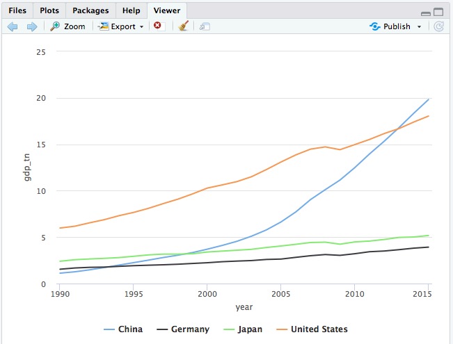
# basic symbol-and-line chart, default settings
hchart(big4, "line", hcaes(x = year, y = gdp_tn, group = country))
The following chart should appear in the Viewer panel at bottom right:
In the code above, the function hchart works similarly to ggplot, and hcaes works like aes in ggplot2. Rather than adding geometries, however, you need to define a chart type, here "line". See here for available Highcharts types.
Now let’s customize this chart:
# define a ColorBrewer palette
cols <- brewer.pal(4, "Set1")

# make chart
big4_chart <- hchart(big4, "line", hcaes(x = year, y = gdp_tn, group = country)) %>%
  hc_colors(cols) %>%
  hc_chart(style = list(fontFamily = "Georgia",
                        fontWeight = "bold")) %>%
  hc_xAxis(title = list(text="Year")) %>%
  hc_yAxis(title = list(text="GDP ($ trillion)")) %>%
  hc_plotOptions(series = list(marker = list(enabled = TRUE, symbol = "circle")))

# plot chart
print(big4_chart)

# save as a web page
saveWidget(big4_chart, "big4.html", selfcontained = TRUE, libdir = NULL, background = "white")
This should be the result:
Clicking on the legend items allows you to remove or add series from the chart.
highcharter uses the %>% or “then” operator, which we have previously used with dplyr.
The first line of the code above sets a palette with four colors, using the “Set1” palette from ColorBrewer. This is then fed to the function hc_colors to use those colors on the chart.
To set options for the entire chart, such as the fonts used, use the hc_chart function.
The hc_xAxis and hc_yAxis functions can be used to add axis labels, to set the range of values for an axis, and to add reference lines or bands to a plot. See here for more.
Combine more than one Highcharts chart type into a single chart
It is also possible to combine different chart types into one, for example columns and dot-and-line.
The following code does this for the food stamps data, plotting the number of participants as columns and the cost as dot-and-line.
# set colors
cols <- c("red","black")

# make chart
food_stamps_combined <- highchart() %>%
  hc_add_series(data = food_stamps$participants,
                name = "Participants (millions)",
                type = "column") %>%
  hc_add_series(data = food_stamps$costs,
                name = "Costs ($ billions)",
                type = "line") %>%
  hc_xAxis(categories = food_stamps$year,
           tickInterval = 5) %>%
  hc_colors(cols) %>%
  hc_chart(style = list(fontFamily = "Georgia",
                        fontWeight = "bold"))

# plot chart
print(food_stamps_combined)

# save as a web page
saveWidget(food_stamps_combined, "food_stamps_combined.html", selfcontained = TRUE, libdir = NULL, background = "white")
This code uses the highchart function rather than hchart. It works a little differently, but allows you to add different variables for each chart type using the function hc_add_series.
This should be the result:
Financial charts using Highstock
Highcharts can be used to produce a wide range of charts, including heatmaps and treemaps. Its cousin Highstock is designed specifically to produce time series of financial data, similar to the charts on Yahoo Finance and Google Finance.
To see this in action, we will first install and load a package called quantmod, used for financial modeling, which allows you to retrieve stock price data from Yahoo Finance or Google Finance.
# install and load quantmod
install.packages("quantmod")
library(quantmod)
The following code retreives stock data for leading technology companies from Yahoo Finance, then draws a Highstocks chart of their daily adjusted closing prices. The quantmod package returns R objects called extensible time series or xts. Their contents can be viewed just like data frames in R Studio.
# retrieve data for each company
google <- getSymbols("GOOG", src = "yahoo", auto.assign = FALSE)
facebook <- getSymbols("FB", src = "yahoo", auto.assign = FALSE)
amazon <- getSymbols("AMZN", src = "yahoo", auto.assign = FALSE)

# set color palette
cols <- brewer.pal(3,"Set1")

# draw chart
stock_chart <- highchart(type = "stock") %>%
  hc_colors(cols) %>%
  hc_add_series(google$GOOG.Adjusted, name = "Google") %>%
  hc_add_series(facebook$FB.Adjusted, name = "Facebook") %>%
  hc_add_series(amazon$AMZN.Adjusted, name = "Amazon") %>%
  hc_legend(enabled = TRUE,
            verticalAlign = "top") %>%
  hc_chart(style = list(fontFamily = "Georgia",
                        fontWeight = "bold")) %>%
  hc_tooltip(borderColor = "black")

# plot chart
print(stock_chart)

# save as web page
saveWidget(stock_chart, "stock_chart.html", selfcontained = TRUE, libdir = NULL, background = "white")
The time period shown can be filtered using the buttons and date boxes at the top, or the slider at the bottom of the chart.
Make maps of seismic risk and earthquakes using Leaflet
Leaflet is the most widely-used JavaScript library for making interactive online maps. It can be accessed from R using the leaflet package, another part of the htmlwidgets framework. So we need to install and load that, together with a package called rgdal, which makes it possible to load shapefiles and other geodata into R.
# install and load leaflet and rdgal
install.packages("leaflet")
install.packages("rgdal")
library(leaflet)
library(rgdal)
We are going to recreate a version of this map, which I originally coded using Leaflet from scratch. After class, you may wish to download the code for that map from its GitHub repository, to compare with the R version.
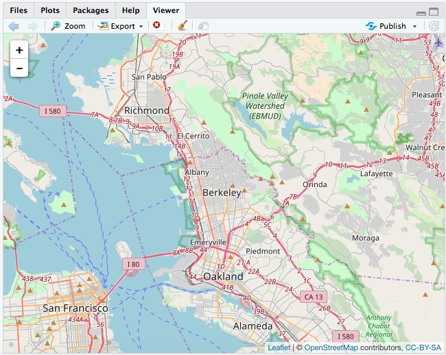
First let’s see how to make a basic Leaflet map, centered on Berkeley:
# make leaflet map centered on Berkeley
leaflet() %>%
  setView(lng = -122.2705383, lat = 37.8698807, zoom = 11) %>%
  addTiles()
This map should appear in the Viewer:
The leaflet function creates a leaflet map.
The setView function sets the starting position of the map, centering it on the defined coordinates and with the defined zoom level; addTiles adds OpenStreetMap tiles to the map, which would otherwise be blank. Notice that the map is interactive, and can be panned and zoomed just like a Google Map.
We aren’t limited to using OpenStreetMap tiles:
# make leaflet map centered on Berkeley with Carto tiles
leaflet() %>%
  setView(lng = -122.2705383, lat = 37.8698807, zoom = 11) %>%
  addProviderTiles("CartoDB.Positron")
The map should now look like this:
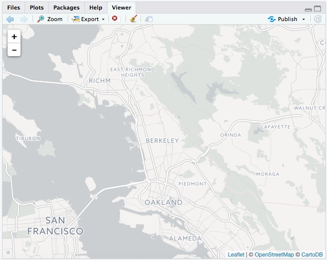
The faddProviderTiles function uses the Leaflet Providers plugin to add various tiles to a map. As we discussed in week 11, you can see the available options here.
Now load the data we need to make the earthquakes map, starting with the seismic shapefile, using the readOGR() function from rgdal.
# load seismic risk shapefile
seismic <- readOGR("seismic", "seismic")
The two mentions of seismic refer to the folder and the shapefile within it, respectively.
You should now have in your environment an object called seismic which is a SpatialPolygonsDataFrame.
We can also load data on earthquakes, directly from the U.S. Geological Survey API described in the notes for week 5:
# load quakes data from USGS earthquakes API
quakes <- read_csv("https://earthquake.usgs.gov/fdsnws/event/1/query?starttime=1960-01-01T00:00:00&minmagnitude=6&format=csv&latitude=39.828175&longitude=-98.5795&maxradiuskm=6000&orderby=magnitude")
Using this url, we have loaded earthquakes since the start of 1960 that had a magnitude of 6 and above, within a 6,000 kilometer radius of the geographic center of the continental United States.
Let’s look at a summary of the seismic data:
# view summary of seismic_risk data
summary(seismic)
This should be returned in the R Console:
Object of class SpatialPolygonsDataFrame
Coordinates:
      min       max
x -124.71 -66.98701
y   24.60  49.36968
Is projected: FALSE
proj4string :
[+proj=longlat +datum=WGS84 +no_defs +ellps=WGS84 +towgs84=0,0,0]
Data attributes:
   ValueRange
 < 1    : 3
 1 - 2  :12
 10 - 12: 2
 2 - 5  : 8
 5 - 10 : 4
The data defining the annual risk of a damaging earthquake is in the variable ValueRange. But as you may remember from our previous mapping classes, the categories of this binned variable are not in the right order. To correct that, we should convert the variable from text to a factor, or categorical variable, and then change the order, using an R package called forcats, which is part of the tidyverse.
# load required package
library(forcats)

# convert to factor/categorical variable
seismic$ValueRange <- as.factor(seismic$ValueRange)

# reorder the levels of the factor
seismic$ValueRange <- fct_relevel(seismic$ValueRange, c("< 1","1 - 2","2 - 5","5 - 10", "10 - 12"))

# view summary of seismic_risk data
summary(seismic)
Now the categories should be in the correct order:
Object of class SpatialPolygonsDataFrame
Coordinates:
      min       max
x -124.71 -66.98701
y   24.60  49.36968
Is projected: FALSE
proj4string :
[+proj=longlat +datum=WGS84 +no_defs +ellps=WGS84 +towgs84=0,0,0]
Data attributes:
   ValueRange
 < 1    : 3
 1 - 2  :12
 2 - 5  : 8
 5 - 10 : 4
 10 - 12: 2
Now we will load the seismic risk data into a leaflet map:
# load the seismic risk data into a leaflet map
seismic_map <- leaflet(data=seismic)
You should now see an object of type leaflet in your environment.
Now we can make a map with two layers just a few lines of code:
# set color palette
pal <- colorFactor("Reds", seismic$ValueRange)

# plot map
seismic_map %>%
  setView(lng = -98.5795, lat = 39.828175, zoom = 4) %>%
  addProviderTiles("CartoDB.Positron") %>%
  addPolygons(
    stroke = FALSE,
    fillOpacity = 0.7,
    smoothFactor = 0.1,
    color = ~pal(ValueRange)
  ) %>%
  # add historical earthquakes
  addCircles(
    data = quakes,
    radius = sqrt(10^quakes$mag)*30,
    color = "#000000",
    weight = 0.2,
    fillColor ="#ffffff",
    fillOpacity = 0.5,
    popup = paste0("<strong>Magnitude: </strong>", quakes$mag, "</br>",
                   "<strong>Date: </strong>", format(as.Date(quakes$time), "%b %d, %Y"))
  )
The function addPolygons adds polygons to the map: stroke = FALSE gives them no outline; fillOpacity = 0.7 makes them slightly transparent; color = ~pal(ValueRange)) uses the color palette and breaks we set up earlier to color the polygons according to values in the ValueRange data.
(To see how to set up a color palette for a continuous variable, see this class from last year.)
smoothFactor controls the extent to which the polygons are simplified. See what happens to the map if you replace 0.1 with 10. Simplified polygons will load more quickly, but there’s a tradeoff with the appearance of the map. Choose an appropriate value for your maps through trial and error.
addCircles adds circles to the map, using the quakes data; color sets the color for their outlines, while weight sets the thickness of these lines; fillColor and fillOpacity style the circles’ interiors.
The size of the circles is set by radius = sqrt(quakes$mag^10)*30. Here 30 is simply a scaling factor for all of the circles, set by trial and error to give a reasonable appearance on the map. The size of the circles is set from the variable mag in the quakes data, which is their magnitude. We have raised 10 to the power of these magnitude values: Again, this is a quirk of working with earthquake magnitudes, which are on a logarithmic scale, so that a magnitude difference of 1 corresponds to a 10-fold difference in earth movement, as recorded on a seismogram.
When scaling circles, use the values from the data, and then take their square roots, using the sqrt function. This is important, to ensure that the circles are scaled correctly, by area, rather than by radius, as we discussed in Week 2.
popup is used to define the HTML code the appears in the popup that appears when any quake is clicked or tapped. The code above uses the R function paste to paste together a series of elements, separated by commas, that will write the HTML. They include the mag and time values from the quakes data, the latter being formatted as an easy-to-read date using R’s format function for dates. See here for more on formatting dates in R.
We can add a legend, and a layer control to turn the quakes layer on and off, and switch between different basemaps, by extending the code further:
# make multi-layered leaflet map with legend and layer-switching control
seismic_final <- seismic_map %>%
  setView(lng = -98.5795, lat = 39.828175, zoom = 4) %>%
  addProviderTiles("CartoDB.Positron", group = "Carto") %>%
  addProviderTiles("Stamen.TonerLite", group = "Toner") %>%
  addPolygons(
    stroke = FALSE,
    fillOpacity = 0.7,
    smoothFactor = 0.1,
    color = ~pal(ValueRange),
    popup = seismic$ValueRange
  ) %>%
  # add historical earthquakes
  addCircles(
    data = quakes,
    radius = sqrt(10^quakes$mag)*30,
    color = "#000000",
    weight = 0.2,
    fillColor ="#ffffff",
    fillOpacity = 0.5,
    popup = paste0("<strong>Magnitude: </strong>", quakes$mag, "</br>",
                   "<strong>Date: </strong>", format(as.Date(quakes$time), "%b %d, %Y")),
    group = "Quakes"
  ) %>%
  # add legend
  addLegend(
    "bottomright", pal = pal, values = ~ValueRange,
    title = "% risk of damaging quake in 2017",
    opacity = 0.7,
    labels = labels
  ) %>%
  # add layers control
  addLayersControl(
    baseGroups = c("Toner","Carto"),
    overlayGroups = "Quakes",
    options = layersControlOptions(collapsed = FALSE)
  )

# plot the map
print(seismic_final)

# save the map
saveWidget(seismic_final, "seismic.html", selfcontained = TRUE, libdir = NULL, background = "white")
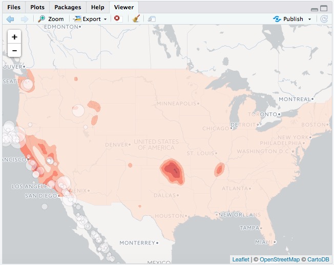
The final map should look like this:
I hope these examples illustrate the potential of htmlwidgets. There are many more which we have not covered. Understanding how the code for each will take some time. But if you follow the documentation, the results can be impressive.
Further reading/resources
htmlwidgets Showcase
Links to documentation and code examples for the leading htmlwidgets.
htmlwidgets Gallery
A more extensive collection of htmlwidgets