Making static maps and processing geodata with GIS
Introducing QGIS
GQIS is the leading free, open source Geographic Information Systems (GIS) application. It is capable of sophisticated geodata processing and analysis, and also can be used to design publication-quality data-driven maps.
The possibilities are almost endless, but you don’t need to be a GIS expert to put it to effective use for both displaying and processing geographic data, whether for online or print maps.
Launch QGIS, and you should see a screen like this:
The data we will use today
Download the data from this session from here, unzip the folder and place it on your desktop. It contains the following folders and files:
ca_healthcareca_counties_medicareShapefile with data on Medicare reimbursement per enrollee by California county in 2012, from the Dartmouth Atlas of Healthcare.healthcare_facilities.csvLocations and other data for hospitals and other healthcare facilities in California, from the California Department of Public Health. I have geocoded those facilities that lacked latitude and longitude coordinates in the raw data.
gdp_pcgpd_pc.csvgdp_pc.csvtCSV file with World Bank data on GDP per capita for the world’s nations in 2014, plus ancillary file for QGIS to understand the data types for each field.
ne_50m_admin_0_countriesNatural Earth shapefile with boundary data for the world’s nations.seismic_riskU.S. Geological Survey shapefile detailing the risk of experiencing a major earthquake across the continental United States.sf_test_addressesShapefile derived from the addresses we geocoded in week 9.
Map Medicare reimbursements and hospital locations and capacities in California
Make a choropleth map showing Medicare reimbursements by county
As we discussed in week 9, choropleth maps fill areas with color, according to values in the data.
We will first import the shapefile in the ca_counties_medicare folder.
Select Layer>Add Layer>Add Vector Layer... or click on this icon:

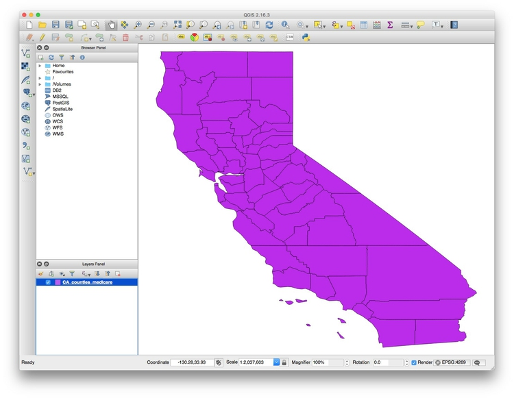
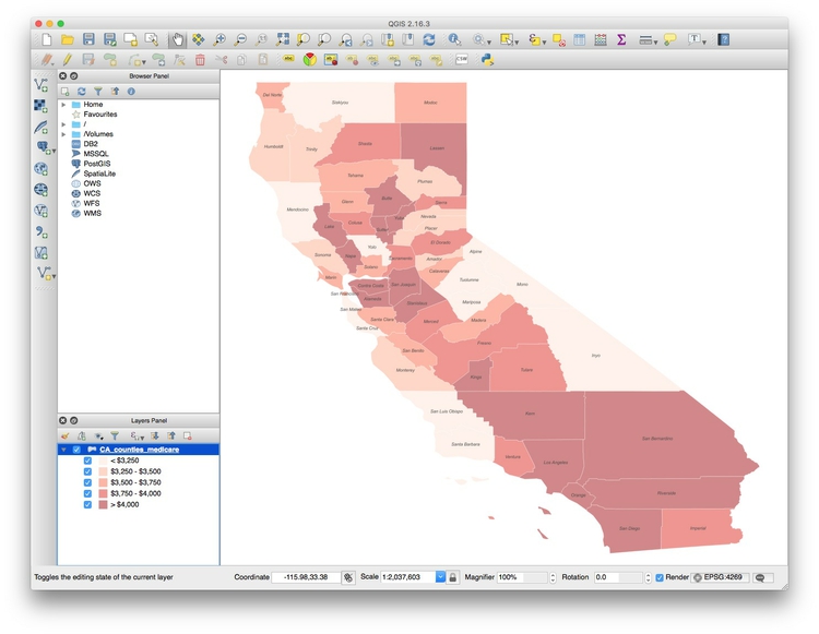
At the dialog box, click Browse and navigate to the file ca_counties_medicare. It is important that you select the file with the .shp extension. Then click open, and the following map of California should appear, filled with a random color:
The Layers panel should now have appeared at left, showing the CA_counties_medicare layer. You can turn off the visibility of any layer by unchecking its box in the Layers panel. This can be useful to see the status of layers that would otherwise be obscured.
These controls allow you to pan and zoom the display:
You can focus the display on the full extent of any layer by right-clicking it in the Layers panel and selecting Zoom to layer.
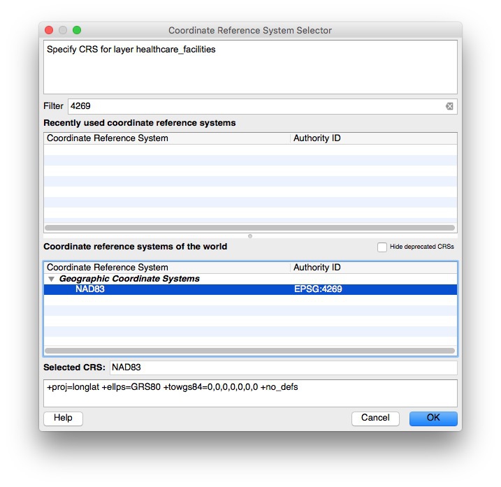
Notice EPSG:4269 at the bottom right. This is defines the map projection and datum for the layer.
Right-click on ca_counties_medicare in the Layers panel at left and select Properties>General. You should see the following under Coordinate reference system:
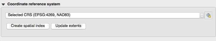
EPSG:4269 and NAD83 mean that this shapefile is in an equirectangular projection, and the NAD83 datum.
(The default for QGIS if no projection is specified is EPSG:4326, which is an equirectangular projection, and the WGS84 datum)
We will select another projection for our map later. Click Cancel or OK to close Properties for this layer.
Now we need to color the areas for the CA_counties_medicare layer by values in the data. Right-click on the layer in the Layers panel and select Open Attribute Table, which corresponds to the .dbf of the shapefile:

Scroll to the right of the table to see the fields detailing various categories of Medicare reimbursement:

We are going to make a choropleth map of reimbursements per enrollee for hospitals and skilled nursing facilities, in the HOSPITAL field.
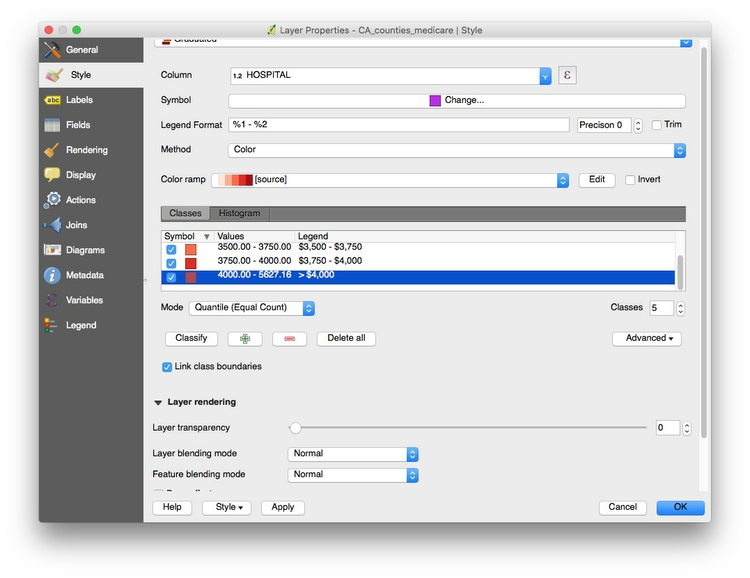
To do this, close the attribute table and call up Properties>Style for the ca_counties_medicare layer. Select Graduated from the dropdown menu at top, which is the option to color data according to values of a continuous variable. Select 5 under Classes, and then New color ramp... under Color ramp. While QGIS has many available color ramps, we will use this opportunity to call in a ColorBrewer sequential color scheme. At the dialog box select ColorBrewer and then Reds, and then click OK:

You will need to give the color ramp a name — the default Reds5 is fine. Select HOSPITAL under Column, and select Quantile (Equal Count) for Mode. This menu gives various options for automatically setting the boundaries between the five classes or bins. Then click the Classify button to produce the following display:

Now let’s edit the breaks manually to use values guided by the quantiles, but which will be easier for users to process when reading the map legend.
Double-click on the first Values and select 3250 for the Upper value and click OK. Then double-click on the corresponding Label and edit the text to < $3,250. Carry on editing the values, using breaks of 3500, 3750, 4000, until the display looks like this:
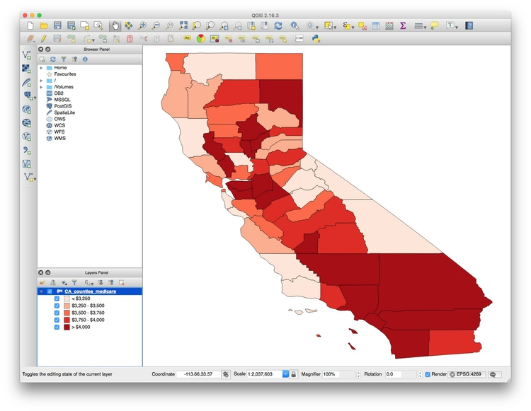
Click OK and the map should look like this:
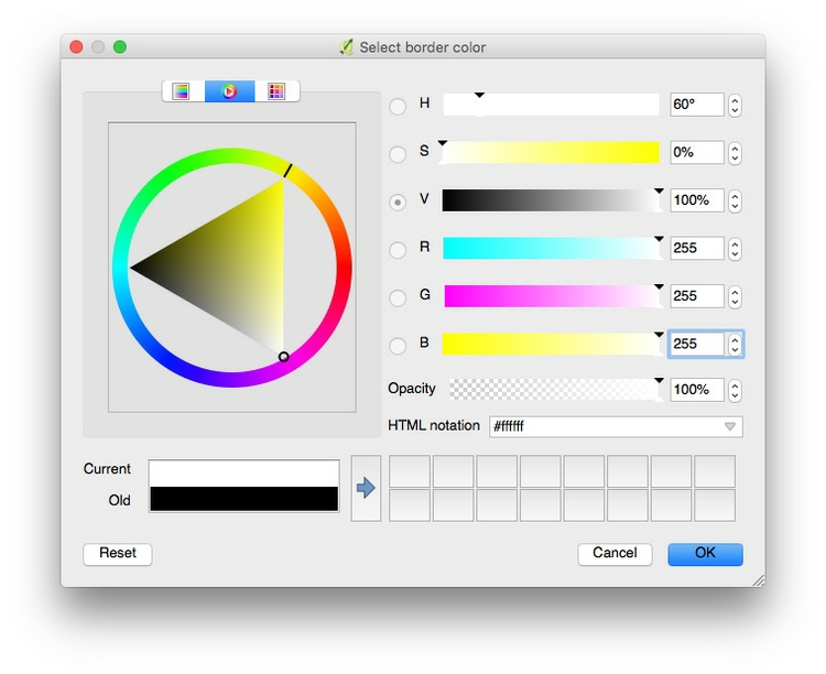
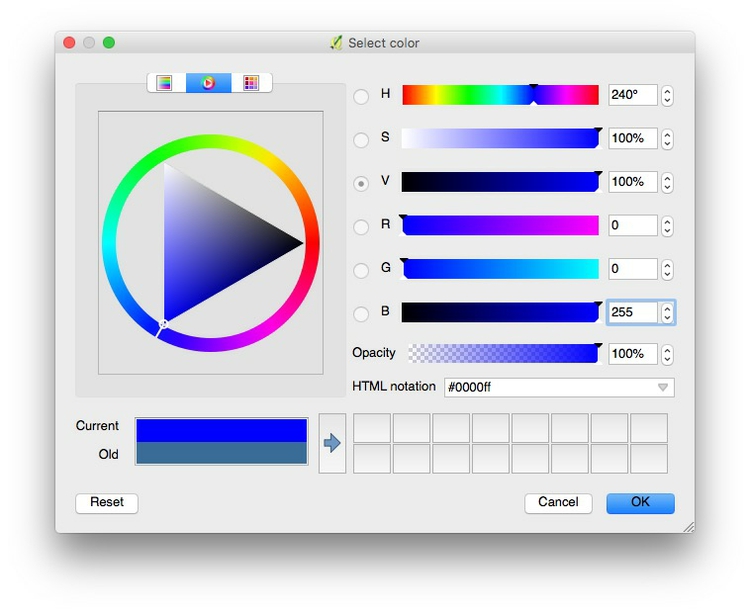
I often prefer white boundaries on a choropleth map. So open up the Style tab under Properties once more and click on Symbol>Change.... Then select Simple fill, click on the color for Outline and in the color wheel tab of the color picker, change the color to white, by setting each of the RGB values to 255, or setting the HTML notation HEX value to #ffffff:
Click on OK until you return to Layer Properties>Style. Then click on Symbol>Change once more, and and set the Transparency to 50% and click OK. This will keep the relative distinctions between the colors, but tone them down a little so they don’t dominate the layer we will later plot on top.
If you are likely to want to style data in the same format in the same way in future, it is a good idea to click the Style button at bottom left and select Save Style>QGIS Layer Style File. This saves the style in QML, which is a variant of XML. When loaded using the Style>Load Style, it will automatically apply the saved styling to future maps.
Click OK in Layer Properties>Style and the map should now look like this:

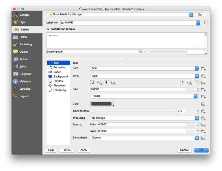
To add labels to the map, select Properties>Labels and fill in the dialog box. Here I am adding a NAME label to each county, using Arial font, Italic style at a size of 8 points and with the color set to a HEX value of #4c4c4c for a dark gray:
Click OK and the map should now look like this:
Save the project, by selecting Project>Save from the top menu.
Now is a good time to give the project a projection: We will use variant of the Albers Equal Area Conic projection, optimized for maps of California.
Select Project>Project Properties>CRS (for Coordinate Reference System) from the top menu, and check Enable 'on the fly' CRS transformation. This will convert any subsequent layers we import into the Albers projection, also.
Type Albersinto the Filter box and select NAD83(HARN)/ California Albers, which has the code EPSG:3311:
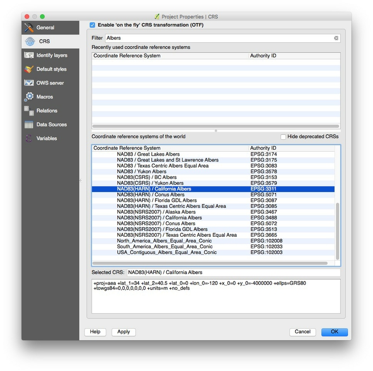
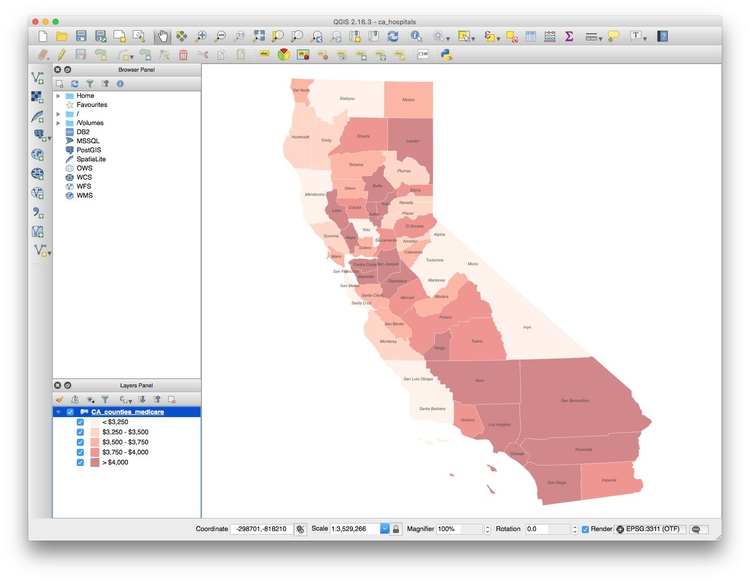
Click OK and the map should reproject. Notice how EPSG:3311 now appears at bottom right:
Add a layer showing locations and capacities of hospitals/skilled nursing facilities
To import a CSV or other delimited text file with points described by latitude and longitude coordinates, select Layer>AddLayer>Add Delimited Text Layer from the top menu or click this icon:

Browse to the file healthcare_facilities.csv, and ensure that the dialog box is filled in like this:
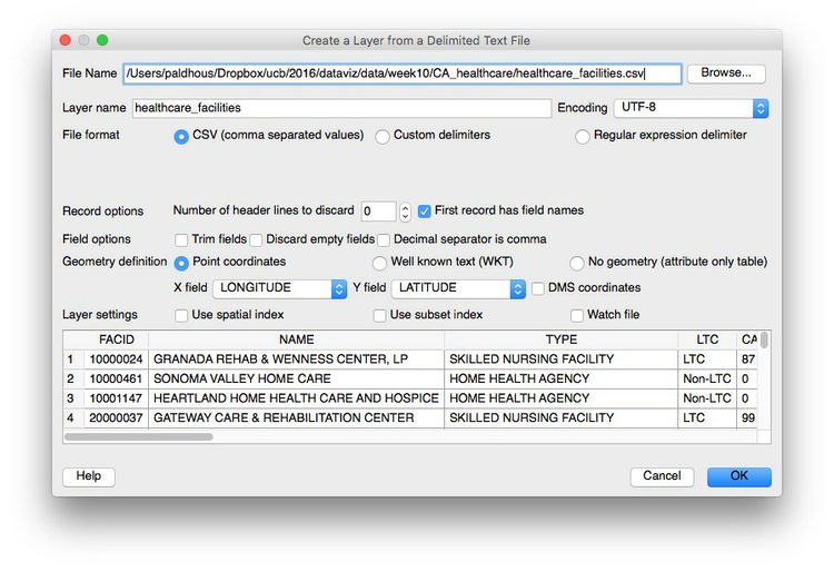
If your text file is not a CSV you will have to select the correct delimiter, and if your latitude and longitude fields have other names, you may have to select the X field (longitude) and Y field (latitude) manually.
When you click OK you will be asked to select a projection, or CRS, for the data. You may be tempted to select the same Albers projection we have set for the project, but this will cause an error. QGIS will handle the conversion to that projection: Because the data in the CSV file is not yet projected, instead select a datum with a default equirectangular projection, either WGS 84 EPSG:4326 or NAD83 EPSG:4269.
Click OK and a large number of points will be added to the map:
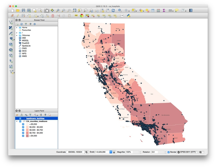
Now we will style these points, using color to distinguish hospitals from skilled nursing facilities, removing other facilities from the map, and scaling the circles according to the capacity of each facility.
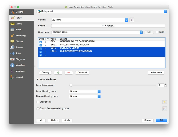
Select Properties>Style for the healthcare_facilities layer, and accept Categorized from the top dropdown menu. Select TYPE under Column and then hit the Classify button. (Keeping Random colors for the Color ramp is fine, as we will edit the colors manually).
Highlight and thes delete, using the button with the red minus sign, the facilities other than General Acute Care Hospital and Skilled Nursing Facility. (This will remove them from the map, but not from the underlying data. )
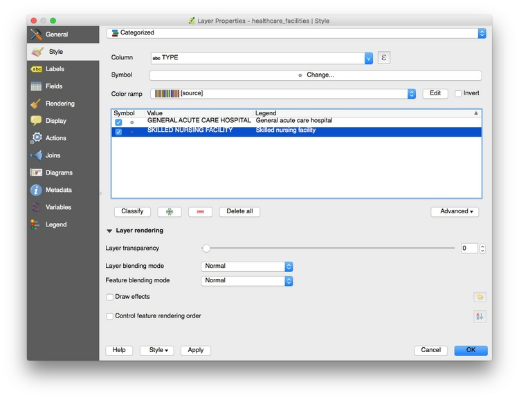
Under Symbol click Change and change the Transparency for the symbols to 50%, then click OK. Also edit the legend entries for the two remaining categories so that they are not in capitals:
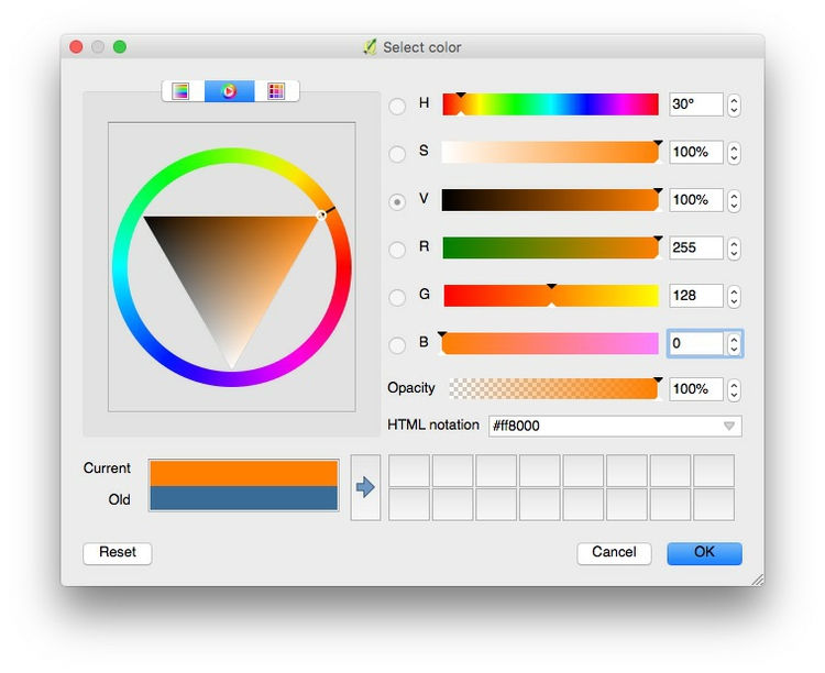
Now double-click the symbols for each of the categories, and change the Color so that the hospitals are blue, and the nursing facilities are orange.
Our next task is to scale the healthcare facilities according to their CAPACITY, in beds. Select both of the categories, right click, and select Change size. At the dialog box, click on this symbol:

Select Size Assistant ... and fill in the dialog box as follows:
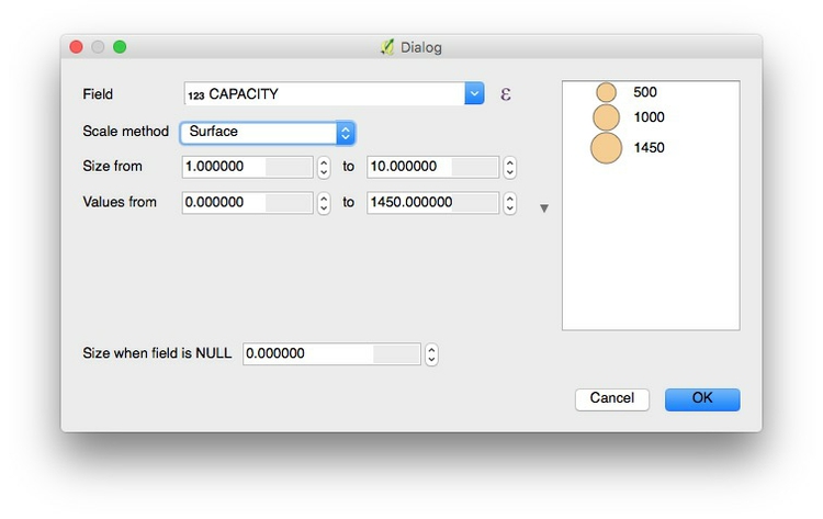
Using the Scale method of Surface will scale the circles by area, according to values in the data; Flannery is a method of scaling that is designed to compensate for the errors people make when estimating the area of circles. You may wish to experiment with this, but I would strongly advise against using Radius, for the reasons we discussed in week 2.
Click OK until you return to the map, which should now look like this:

Export the finished map in raster image or vector graphic formats
We will export our finished map with a legend, so let’s change the name of the fields so they display nicely. Right-click on each layer and rename them Facility type and Medicare reimbursement per enrollee respectively.
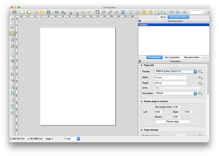
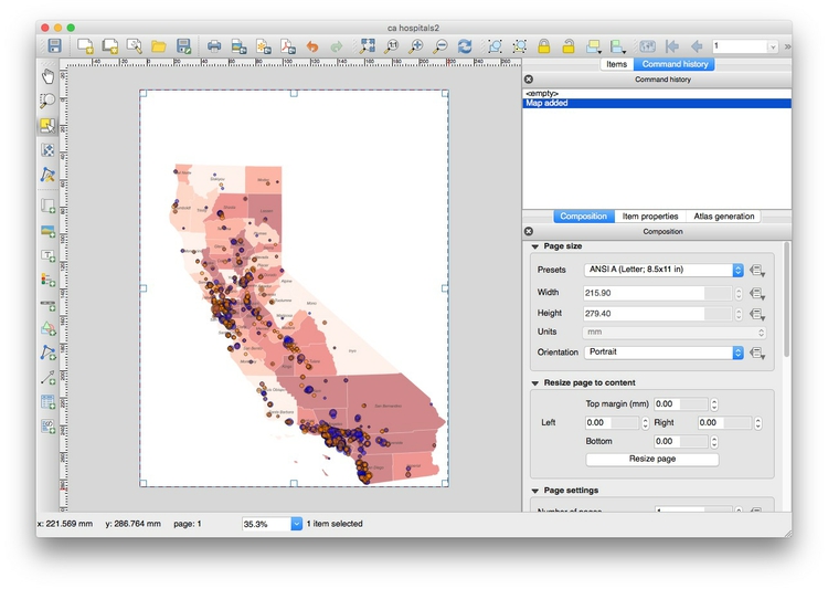
To export the map, select Project>New Print Composer, give the composer an appropriate name and click OK. In the print composer window, select the following options in the Composition tab (I have chosen a Portrait orientation to best fit the shape of California):
Now click the Add new map icon:

Draw a rectangle over the page area, and the map should appear. At this point, you may need to alter the zoom level and position of your map in the main QGIS display to get a pleasing display in the print composer. (In this case, it is also worth changing the size/shape of the main QGIS window to match the portrait orientation.)
Your print composer should now look something like this:
Once you are statisfied with the appearance of your map in the print composer, click the Add new legend icon:

Draw a rectangle on the page where you want the legend to appear:
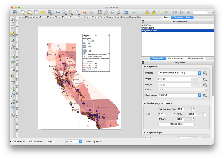
In the Item properties tab, edit Fonts and other options as desired. Here I have deleted the default Title of Legend, removed the legend item for the scaling of the facilities, which was rather ugly, and edit the text for Facilty type to explain the scaling:
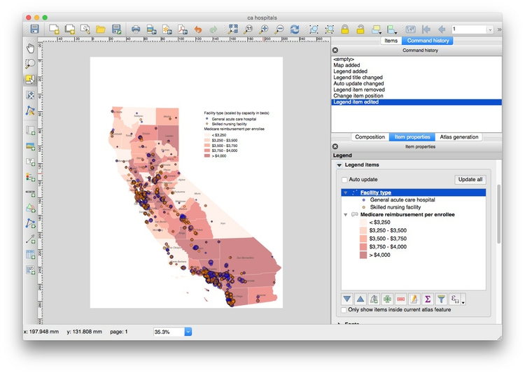
Note: To remove an item from the legend, you must first uncheck Auto update; then select and use the red minus symbol to remove items.
You can save your maps in raster image formats (JPG, PNG etc) from the Print Composer by clicking the Save Image icon:

The map can be exported in SVG and PDF vector formats by clicking these export icons:

Note that the SVG export may not clip the map to the page exactly. However, this can be fixed in a vector graphics editor such as Adobe Illustrator, and then saved as a PDF. This may provide a better rendering of the map than through a direct PDF export.
You can also save as an image from the main map display (so without any legend and annotation added in the Print Composer) by selecting Project>Save as Image from the top menu.
Finally, save the QGIS project.
Join external data to a shapefile
Open a new project by selecting Project>New from the top menu.
In this new project, import the ne_50m_admin_0_countries shapefile. Right-click on it in the Layers panel and Save As ... an ESRI shapefile, keeping the default WGS 84 CRS. Browse to the gdp_pc folder, call the new file gdp_pc and check the option to Add saved file to map.
Open the attribute table of the new shapefile and notice that it contains a field called iso_a3, which is a three-letter code for each country, assigned by the International Organization for Standardization.
Now use Add Vector Layer to import the file gdp_pc.csv. (Note that when joining external data in a CSV file to a shapefile, you do not import the file as a delimited text file, as we did previously to display data on a map.)
After import, this file will appear as an isolated table in the Layers panel. Select it and open the attribute table to view the data, which contains country names, the three-letter country codes, and data on GDP per capita in 2014:
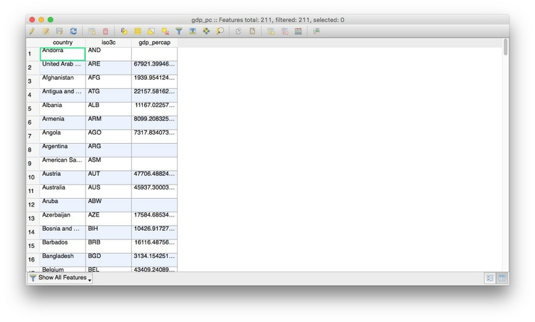
Notice that some cells contain the value -99, which is here being used to designate null values, where there is no data.
The same subfolder with the file also contains the file gdp_pc.csvt. This contains information about the type of data in each field of the CSV file, in this case:
"String","String","Real"
When we make the join, this will tell QGIS what sort of data is in each field of the CSV file. String indicates a string of text, Real indicates numbers that can include decimals, while Integer indicates whole numbers. Without this information, QGIS will treat all of the fields in the file as text.
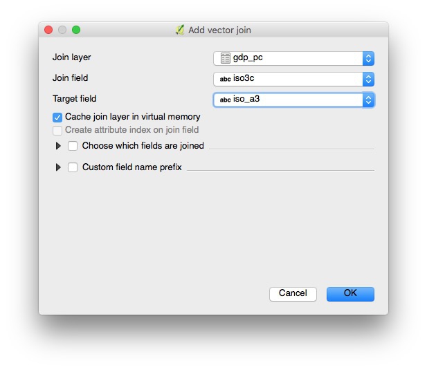
Close the attribute table once more, right-click on the gdp_pc shapefile and select Properties>Joins. Click the green plus sign and fill in the dialog box as follows to join the CSV file to the shapefile by the iso_a3 three-letter country codes:
After completing the join, open the shapefile’s attribute table once more to confirm that the data from the CSV file has appeared.
Save the joined data in another geodata format
Right-click on the joined shapefile, select Save As ... and notice the Format options include ESRI shapefile, GeoJSON and KML. You are also able to choose a projection (CRS) for the new file and restrict its extent by latitude and longitude coordinates.
Save this file as GeoJSON with an appropriate name, keeping the default WGS 84 CRS.
Simplify the joined data, and save again
When displaying geodata online, it is sometimes necessary to simplify boundary data to give a smaller file size, allowing faster loading in a web browser.
Select the joined shapefile, then select Vector>Geometry Tools>Simplify geometries, and fill in the dialog box as follows, saving as a shapefile with a new name:
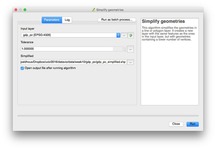
In practice, you will want to experiment with different values for Simplify tolerance to give an acceptable trade-off between file size and appearance at high zoom levels.
Save the simplified file as GeoJSON, and compare the file size with the previously saved version.
Alternatively, you can also simplify geodata outside of QGIS using the mapshaper web app. This has the advantage that you can move a slider to control the amount of simplification, and see the effect that this will have before exporting the simplified file.
Use QGIS’s vector geoprocessing tools
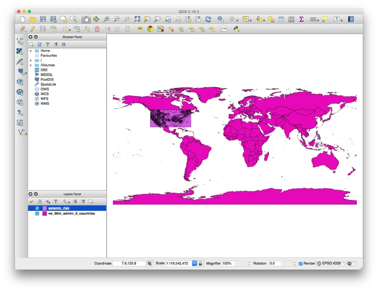
Start a new project, and import both the ne_50m_admin_0_countries shapefile, and the seismic_risk shapefile, which describes the risk of experiencing a damaging earthquake across the continental United States. Note that it extends beyond the boundaries and coastline of the U.S.:
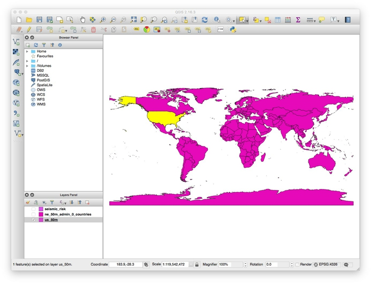
Right-click on the ne_50m_admin_0_countries layer, and Duplicate. Then Rename this layer as us_50m.
Turn off the visibility of the other two layers, turn on the visibility of the us_50m layer, highlight it, and click the Select feature(s) button:

Now click anywhere within the borders of the United States to select the nation, which should now appear yellow:
Open the attribute table for this layer, and scroll down until you find the United States, which will be selected:
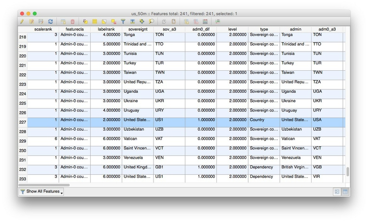
Now click the invert selection button to select all the countries apart from the United States:

Click the pencil icon at top left to switch to editing mode:

Hit the delete button, which looks like a trash can, to delete all the other countries:

Close the attribute table, then click on the pencil icon at top left and save the changes to the us_50m layer.
Select Vector>Geoprocessing Tools>Clip from the top menu and fill in the dialog box as follows:
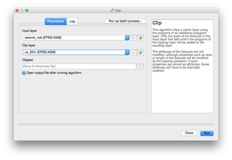
Click OK and a new layer will be created, clipped to the borders and coastline of the United States:
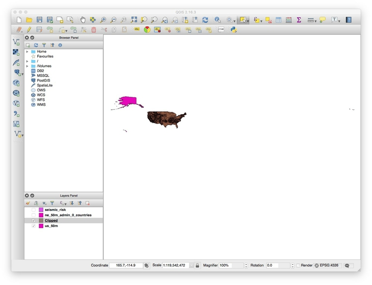
You can now right-click on the new Clipped layer and Save As ... as a shapefile, GeoJSON, or another geodata format.
Sometimes you may need to draw your own shape to clip to, rather than using existing geodata. When drawing shapes based on city streets, this web app can be a useful tool. Select the Polygon and KML options from the dropdown menu and draw your shape over the basemap.
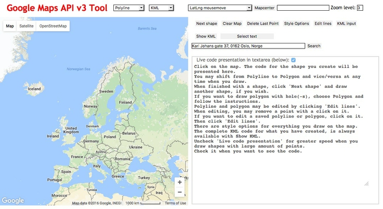
Paste the resulting code into a text file and save with the extension .kml. You can then use this KML file as a clip layer in QGIS.
Look at the other options in the Vector>Geoprocessing Tools menu. Their icons give a good idea of what they do. (Intersect is similar to Clip, except that it includes data from both layers in the new attribute table.)
Now open a new project, and import the shapefile sf_test_addresses. I made this shapefile from the addresses we geocoded in week 9. I saved it in a Google Mercator projection, also known as EPSG:900913, used for Google and other online maps.
This is important, because we are going to create a “buffer” defining areas within 1,000 feet of the nearest point. For this we need a projection with units defined in distance, rather than degrees, which is the unit for the WGS 84 datum.
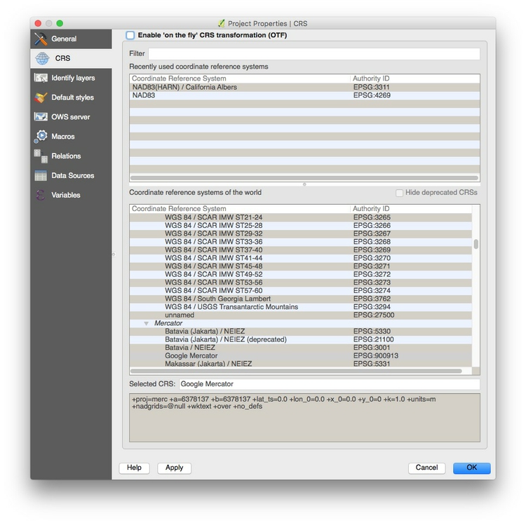
To confirm the units for the Google Mercator projection, click on the globe symbol at bottom-right:

You should see that the CRS/projection information that appears near the bottom of the dialog box contains +units=m, which tells us that distances in this projection are measure in meters:
Creating a buffer shapefile is a task you might perform if, for example, working out which areas are off-limits for sex offenders under residency restrictions.
Select Vector>Geoprocessing Tools>Fixed distance buffer and fill in the dialog box as follows:
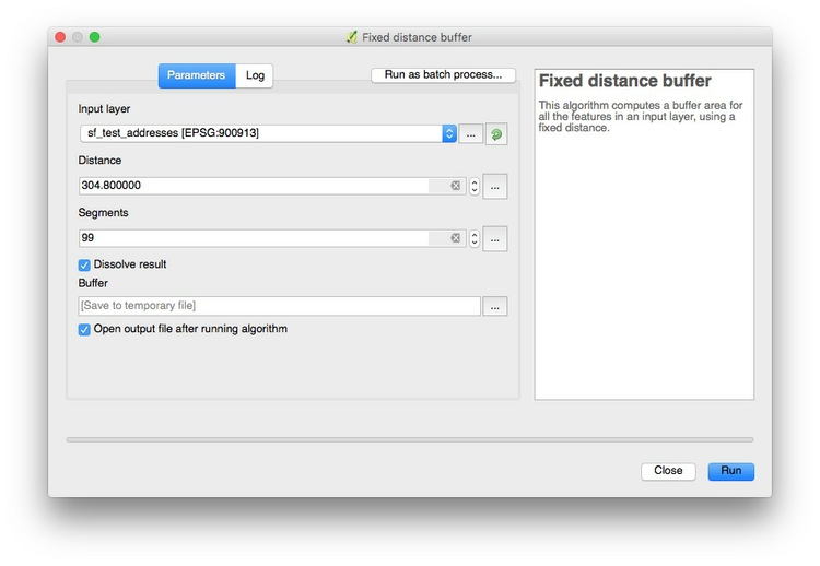
Selecting 99 under Segments to approximate ensures that the resulting shapes are as smooth circles. Buffer distance is set to 304.8 because the projection’s units are meters; this value gives the 1,000 feet we require. Checking Dissolve result merges overlapping buffers into the same polygon.
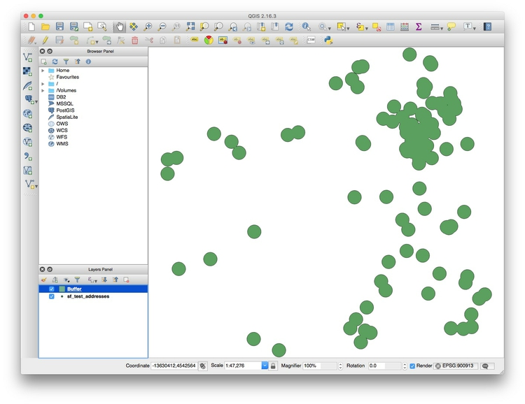
Click OK, and this should be the result:
Again, you can now right-click on the new Buffer layer and Save As ... as a shapefile, GeoJSON, or another geodata format.
Assignment
- Submit an update on your final project, detailing the data you are using, the questions you want to address.
- Share your data and any visualizations made so far with me.
- Pay particular attention to explaining any obstacles/problems, so we can brainstorm/solve.
- You should arrange meetings to discuss your work as required. Make appointments on the Google Calendar we used previously to arrange meetings during my office hours, on Friday afternoons. I can stay as late as 6pm. If those times are not convenient, email me to arrange a time to talk by Skype.