Final project
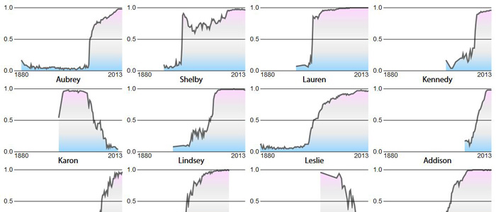
Gender-Shifted Names
A set of graphics showing the relative distribution over time of the 100 names with the biggest shifts between men and women.
View ProjectTableau Public assignment
Growing Economies Take Different Paths to Development
The so-called BRICS nations, Brazil, Russia, India, China, and South Africa, have some of the fastest growing economies in the world. As countries develop, their GDP per capita and life expectancy tend to increase in sync. However, global events, and traits specific to certain nations can disrupt this relationship. In these figures, life expectancy increases as you move up the graph, and GDP increases as you move to the right. The size of the dot correlates to infant mortality. Ideally, a country wants to move towards the top right, increasing both life expectancy and GDP per capita, and decreasing infant mortality.
